Starter quiz
- Which of the following is true for a histogram with unequal bar widths?
- The highest bar shows the modal class.
- The bar with the largest area shows the modal class. ✓
- The frequency is the frequency density class width.
- The lowest bar shows the class width with the lowest frequency.
- The highest bar shows the class width with the highest frequency.
-
- Here are the times taken to type the alphabet. Match the class width with its frequency.
- ⇔Frequency = 4 ✓
- ⇔Frequency = 8 ✓
- ⇔Frequency = 20 ✓
- ⇔Frequency = 16 ✓
- ⇔Frequency = 5 ✓
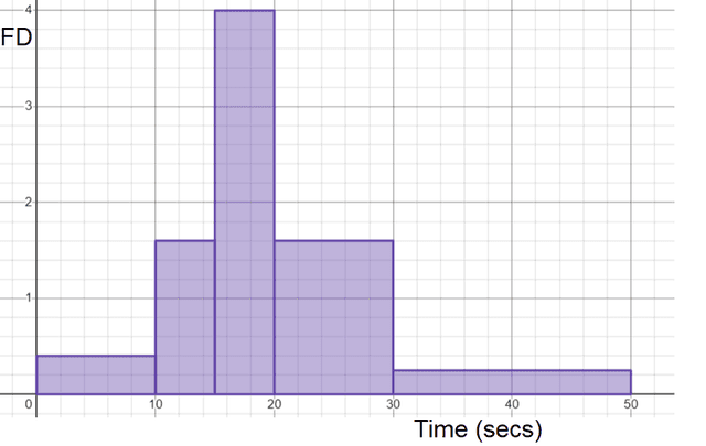
- Here is a histogram showing the time it takes to solve a puzzle. Match the class width with its frequency.
- ⇔10 ✓
- ⇔12 ✓
- ⇔15 ✓
- ⇔14 ✓
- ⇔5 ✓
- Which class' scores were more consistent?
- A - median is lower
- B - median is higher
- A - similar IQR to B but smaller range ✓
- B - similar IQR to A but smaller range
-
- Calculate the interquartile range from this cumulative frequency graph.
- '8' ✓
- This table show information about the times taken by some children and adults to complete a puzzle. Compare their times. Which is the correct response to this question?
- On average the children did better and their times are more consistent.
- On average the children did better and their times are less consistent.
- The children's median was lower and their interquartile range was higher.
- On average the adults did better but their times are less consistent. ✓
- The adults median was better and their interquartile range was lower.
-
Exit quiz
- Match the statement with the definition.
- A boxplot⇔a diagram that clearly shows the min and max values and the quartiles ✓
- A histogram⇔a diagram with rectangles whose area is proportional to the frequency ✓
- Lower quartile⇔the value under which 25% of data points are found ✓
- Upper quartile⇔the value under which 75% of data points are foun ✓
- Here are some test scores for Class A and Class B. Select the statement which is true.
- 50% of Class A scores were more consistent with the median than Class B. ✓
- 50% of Class B scores were more consistent with the median than Class A.
- Both classes were equally consistent.
-
- Here are two box plots showing the scores of two classes. Select the statements which are true.
- The medians are the same.
- The ranges are the same. ✓
- The IQRs are the same. ✓
- The medians are different. ✓
- The ranges are different.
-
- Here are three different cumulative frequency graphs showing different classes' test percentages. The scale is unlabelled but is the same for all graphs. Which class has the lowest average score
- A
- B
- C ✓
-
- Here are three box plots showing different classes' test percentages. The scale is unlabelled but is the same for all graphs.
- Class C⇔has the most consistent scores as the IQR and range is the smallest ✓
- Class B⇔is on average the lowest performing class ✓
- Class A and B⇔have the same IQR and range ✓
- Class A and C⇔have on average the higher performing students ✓
- Here are some masses of sweets in a bag. 50% of the sweets are ≤ 120 g but greater than 80 g. What percentage are greater than 120 g but less than or equal to 180 g?
- '25%' ✓
Worksheet
Presentation
Video
Lesson Details
Key learning points
- Different representations of the same data set give a fuller picture
- It is important to identify what features are used to analyse a data set
- It is important to identify what features are used to compare two data sets
Common misconception
Histograms with unequal bar widths are plotted against the frequency and/or pupils read the frequency density as the frequency of the class width.
Show what a histogram with unequal bar widths looks like when plotted against frequency. This visual aid will show pupils the distribution of data is difficult to see.
Keywords
Box plot - A box plot is a diagram that clearly shows the minimum and maximum value of a data set long with the three quartiles.
Lower quartile - The lower quartile is the value under which 25% of data points are found when they are arranged in increasing order. Also known as the first quartile (Q1).
Upper quartile - The upper quartile is the value under which 75% of data points are found when they are arranged in increasing order. Also known as the third quartile (Q3).
Histogram - A histogram is a diagram consisting of rectangles whose area is proportional to the frequency in each class and whose width is equal to the class interval.